Fallout Nuka-Cola Bottles
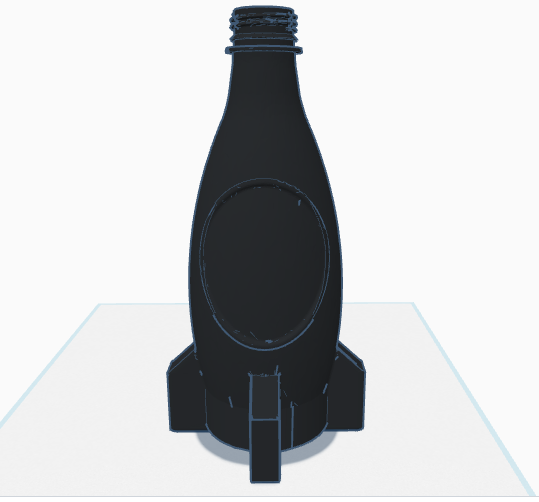
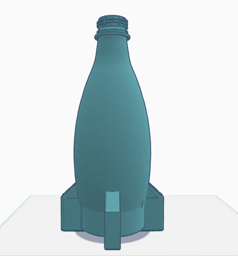
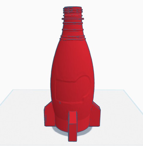
I've made these Fallout Nuka-Cola bottle models to look like faithfull replica of the ones in the game with a few modifications. I created one model of each bottle type that utilized a standard 20oz soda bottle top. I plan to use them to create some molds that I can use to blow mold some 20oz style bottles from purchased preforms.
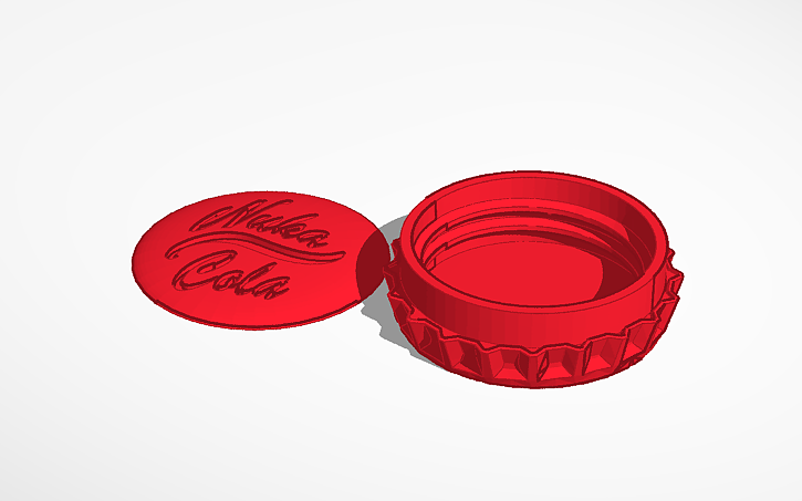
I also made a 20oz screw cap to look like a crown cap. I plan to make a slip over version of this that can be put over a standard size bottle cap. The bottle cap is divided into 2 parts that need to be glued together. I did this so that they can be printed with a lot of detail where it is really needed. Supports always mess up the details on prints for me so this was a good way to avoid creating supports over any of the detailed surfaces.
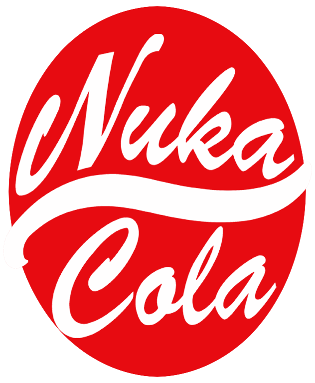
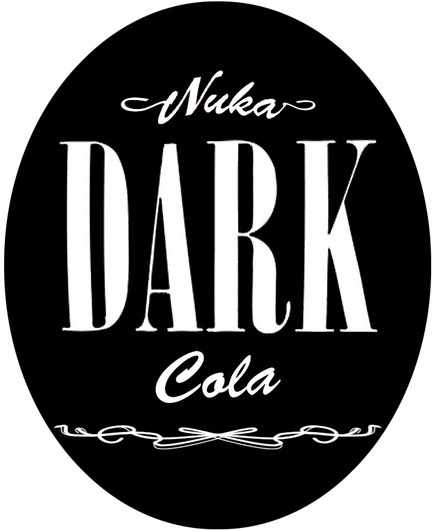
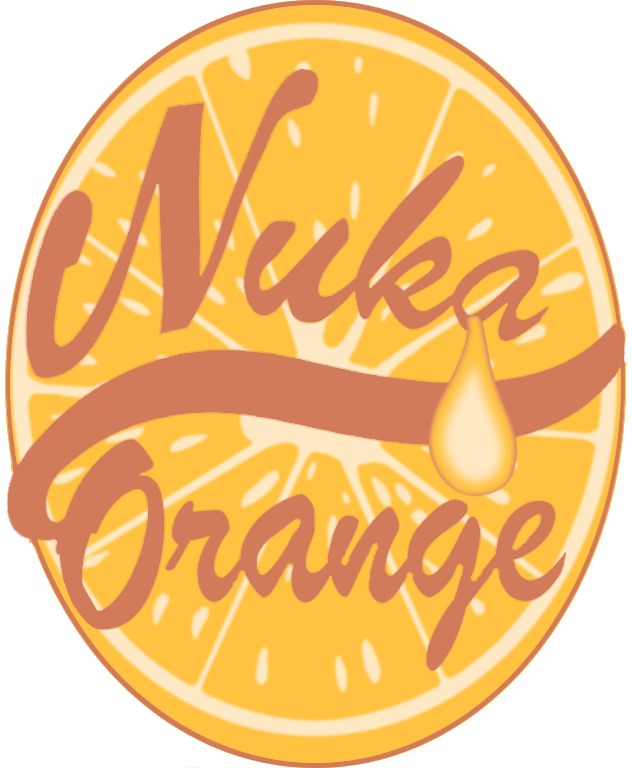
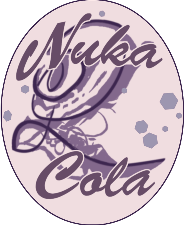
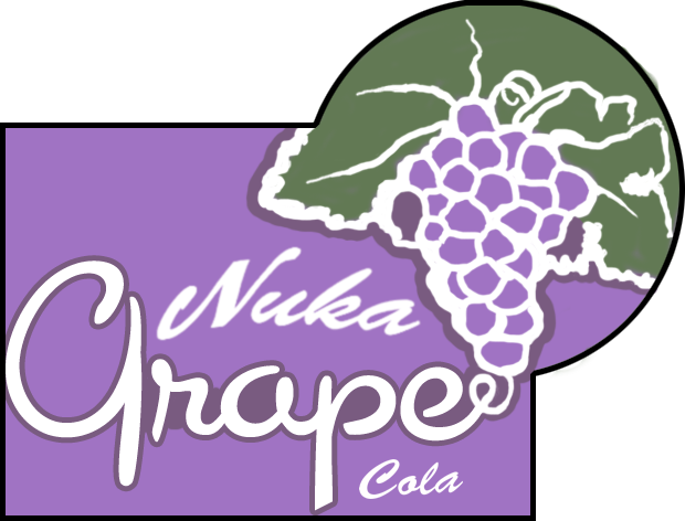
To go along with the bottles I have been working on recreating the various labels. I have done my best to keep them as acurate as possible while increasing the resolution, cleaning them up, and separating the colors out for printing. There are a lot of labels out there that are just blown up images from the game. There are also many that have just been quickly reproduced without any thought to the original artwork.
The attention to details in the original labels is quiet astonishing. Everything from the font's, colors, and general artistic approach are incredibly "period" acurate. Recreating these labels has given me so much more appreciation for the effort that went into the original artwork. There are so many details that are in these labels that you would never even notice in the game. For instance the orange slice in the background of Nuka Orange actually makes full use of the label height to give the orange a 3d appearance on the label. Where the orange "skin" can be seen on both the top and bottom. The background of the Quartz label isn't just random scribles. It's a pinstripe "Q" with a artistically broken and distored outline shadow with little hexegons.
The Nuka Grape label uses a period correct style "upright script" font that would have been commonly used for signage in the 30's and 40's. The specific font is called "Cocktail Script". The lettering in each label is also hand customized for the prurpose. Little things like the 'p' in Grape being trimmed off on the bottom or the connecting of the 'e' to the grapes. It took a lot of thought to figure out what the original artist was trying to do with some of these. Recreating the pinstriping for Nuka Dark in highres took a couple of hours, but I think they turned out great. Even though the label doesn't use the whole stripe I left a full untrimmed copy of it in the psd for the label.
Enjoy the images in full detail by clicking on them. All the files are available on the downloads page if you would like to 3d print some bottles/labels of your own. I haven't created any labels yet for the quantum bottle type, but I will add them to the site as I get them made.
